HTML guidelines
- Use HTML5
(footer, header, section,nav, article..) - SEO standards must be applied, for example (images tag have alt, a tag have link or arial-label ..) https://www.yebsait.com/en/best-practices-for-html-seo-in-2022
- Attention: correctly use of tag’s purpose such as
table,h1,h2,ul,p.. - Always add
titletag and Favicons image for site - The
h1-h6must be in order in 1 block - Validate HTML on https://validator.w3.org/
- Standardize class name and id using dash-style (eg. media-title) or BEM http://getbem.com/introduction/
- Refer HTML style guide on https://www.w3schools.com/html/html5_syntax.asp
CSS guide
- Always use SCSS in stead of CSS
-
Better use short-hand format
/* LONG CODE IS LONG */ padding-top: 1px; padding-right: 2px; padding-bottom: 1px; padding-left: 2px; /* BETTER */ padding: 1px 2px 1px 2px; /* BEST */ padding: 1px 2px; -
If the value is 0, writing the full 0px is unnecessary
/* BAD */ padding: 0px 10px; /* GOOD */ padding: 0 10px; - Avoid to use key word !important, only in case of force majeure
-
If the color and spacing values repeat many times, we should use variables.
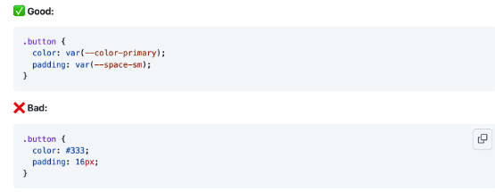
-
Avoid css nesting (should not exceed 3 levels)
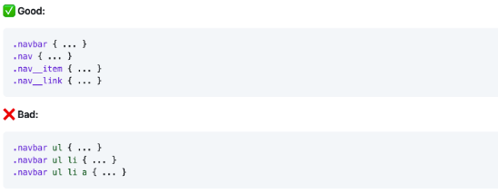
-
Mobile first
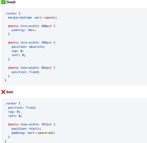
- Use REM instead of px unit (reset html to font-size: 62.5%; 10px = 1rem)
- Use the bootstrap latest version, recommend using only bootstrap's mixins instead of using their entire css component because it will be redundant and slow down the performance.
- Go to https://icomoon.io/app/#/select to create icon, or take company’s icon svg in (https://fontawesome.com/)
- With icon images, remember to use 2x size for mobile devices like iphone, tablet.. Because these devices use retina high resolution, icon images will likely be pixelated. In case there are several icons, you should combine them into one file to increase performance when loading
- Go to for more css standard reference https://google.github.io/styleguide/htmlcssguide.html
JAVASCRIPT guide
- Should use jquery latest version
- Should follow ES6 standard in writing
- For Jcarousel use slick Slick,Swipejs
- Use Wowjs for effectionWowjs, or greensock
- For Mansory use link
- Use lazyload imagesLoaded imagesLoaded
- Some other js libraries are better to use with bootstrap’s dependencies.
- When adding bootstrap js, only add the necessary js components to avoid redundancy and heaviness.
-
Js file should be added in footer of the file before
body - Remove all “console.log” code in file after complete developing
- Download and concat all plugin files in vendor.js
- Prevent use search whole DOM in page
- Prevent use DOM in loop
- Go to for more css standard reference https://code.tutsplus.com/tutorials/24-javascript-best-practices-for-beginners--net-5399
Media guide
- Use SVG images for logos and some areas that require high resolution
-
Use image first load in special case
link rel="preload" href="./assets/icons/default/electrolux_logo_sg.svg" as="image" - Use JPG and PNG images size less than 400KB
- Use MP4 video files less than 5MB
- Use lazyload library to increase website performance
- Use standard media ratio 1:1, 16:9. Or as customer’s requirement
-
Video from vimeo/ youtube should be used. In case of special requirement, use the
videoHTML5 - If they want to customize play button or do some effects but embed iframe doesn't work, they have to use vimeo/ youtube's API player library
EDM guide
- Use table elements to build EDM that can insert tables for complex layouts
- Inline CSS rules
- Always use back-end font backup for special fonts
- Template size is normally less than 600px - 800px
- Avoid background images because several email servers do not support it.
- Avoid blank spaces and empty tags
- Image elements should have width, height, and alt attributes
- Shoud use doctype Transitional DOCTYPE
-
Prevent import adobe font by by
Linktag . Use import font like code below
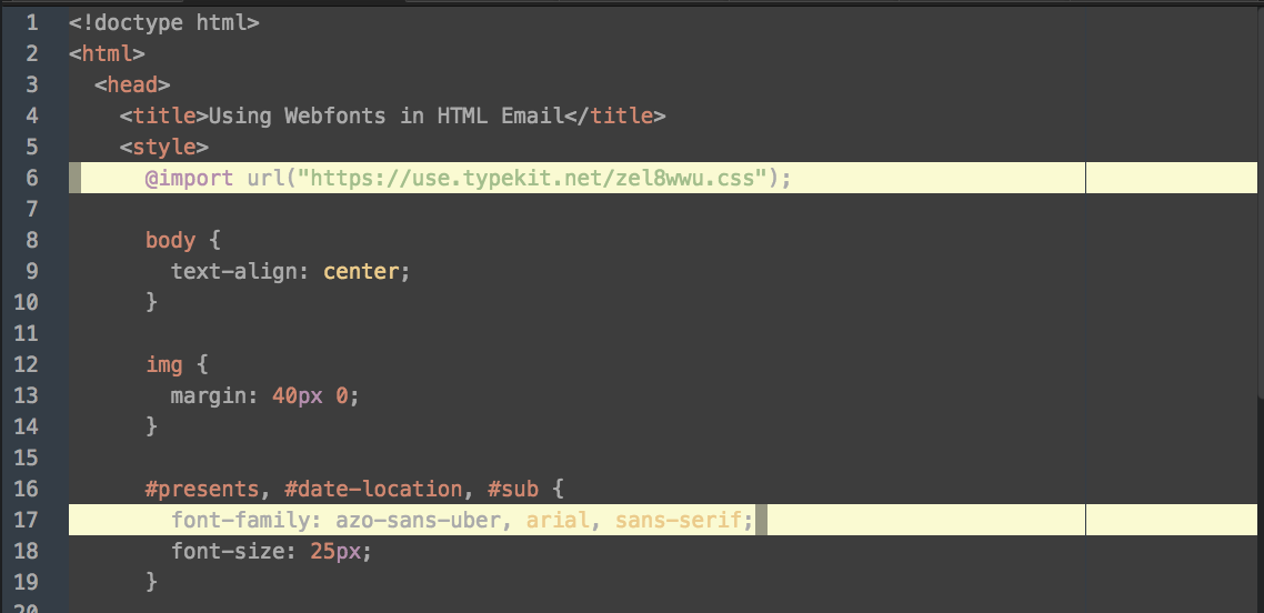
- Use Litmus to test
- Link for sample rules and template
Final notes / Checklist
-
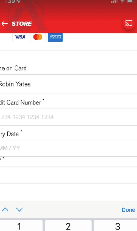
On mobile, the input tags when focusing or zooming the website cause the broken view, set font size to 16 or initial to avoid the zoom broken layout
-
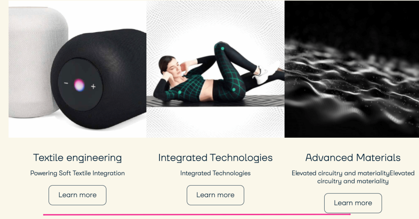
Column layouts have a button at the bottom when the content is not the same leading to being in different level, so try to make those buttons equal.
-
The space between each blocks is not equal

-
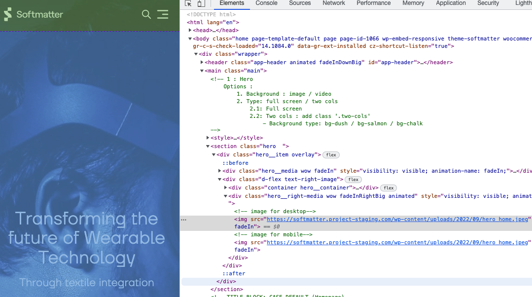
Hero/banner component should have images for mobile
-
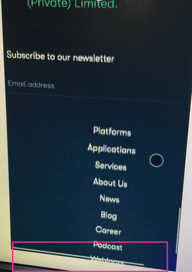
Horizontal scroll bar on mobile
-
Pay attention to the
selecttags on safari, it is often displayed as default style due to the lack of -webkit-appear: none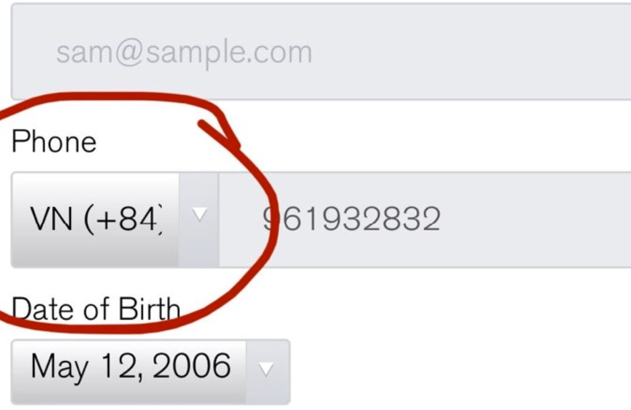
- To avoid the phenomenon that after the page loads again, there is a font change from the default font of the machine's font to the font of the website, we need to put the font on top so that the font The text is loaded before the html is loaded, this helps when loading html that already has the site's font standard.
- Date Time format must follow Australian style: 13 May 2022 hoặc/ or 13/05/2022
- Browser testing: chrome, safari, firefox, IE edge environments
- Devices testing : Mac OS, Window, IOS, Android
