Back
REM
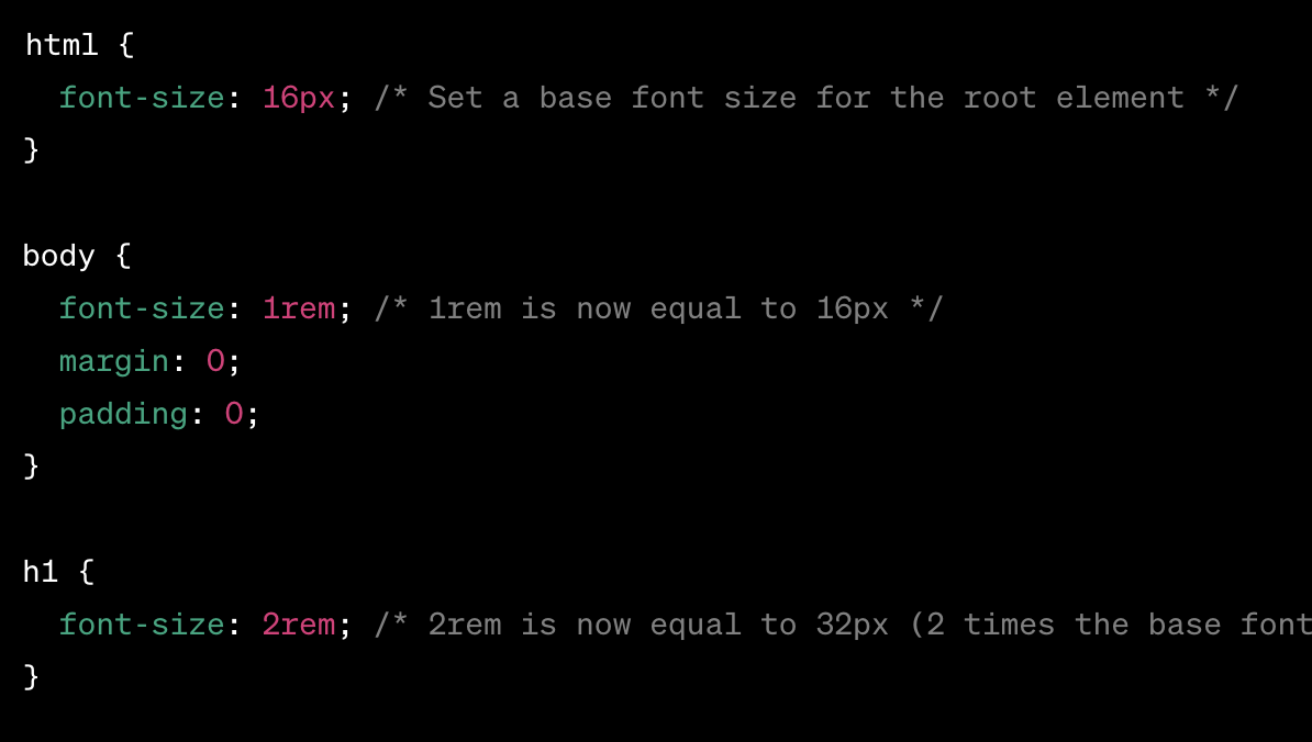
In CSS, rem stands for "root em." It is a unit of measurement that is relative to the root element's font size. The root element is usually the html element of your document. The rem unit is particularly useful for creating a more scalable and consistent design because it's not affected by the cascading nature of CSS.
-
Scalability and Consistency:
- rem units are relative to the root (html) font size. This allows for easy scalability by setting a base font size on the root element and using rem throughout the stylesheet.
- rChanges to the root font size will proportionally affect all elements using rem, providing a consistent and scalable design.
-
Readability and Maintainability:
- Using rem units can enhance readability and maintainability by providing a clear, consistent, and relative unit for font sizes and spacing.
- Developers can easily understand and modify the design by referencing a single base font size.
-
Reduced Dependency on Parent Elements:
- Unlike em units, which are relative to their parent element's font size, rem units are not affected by the cascading nature of CSS. This reduces dependency on the font size of parent elements, making styles more predictable.